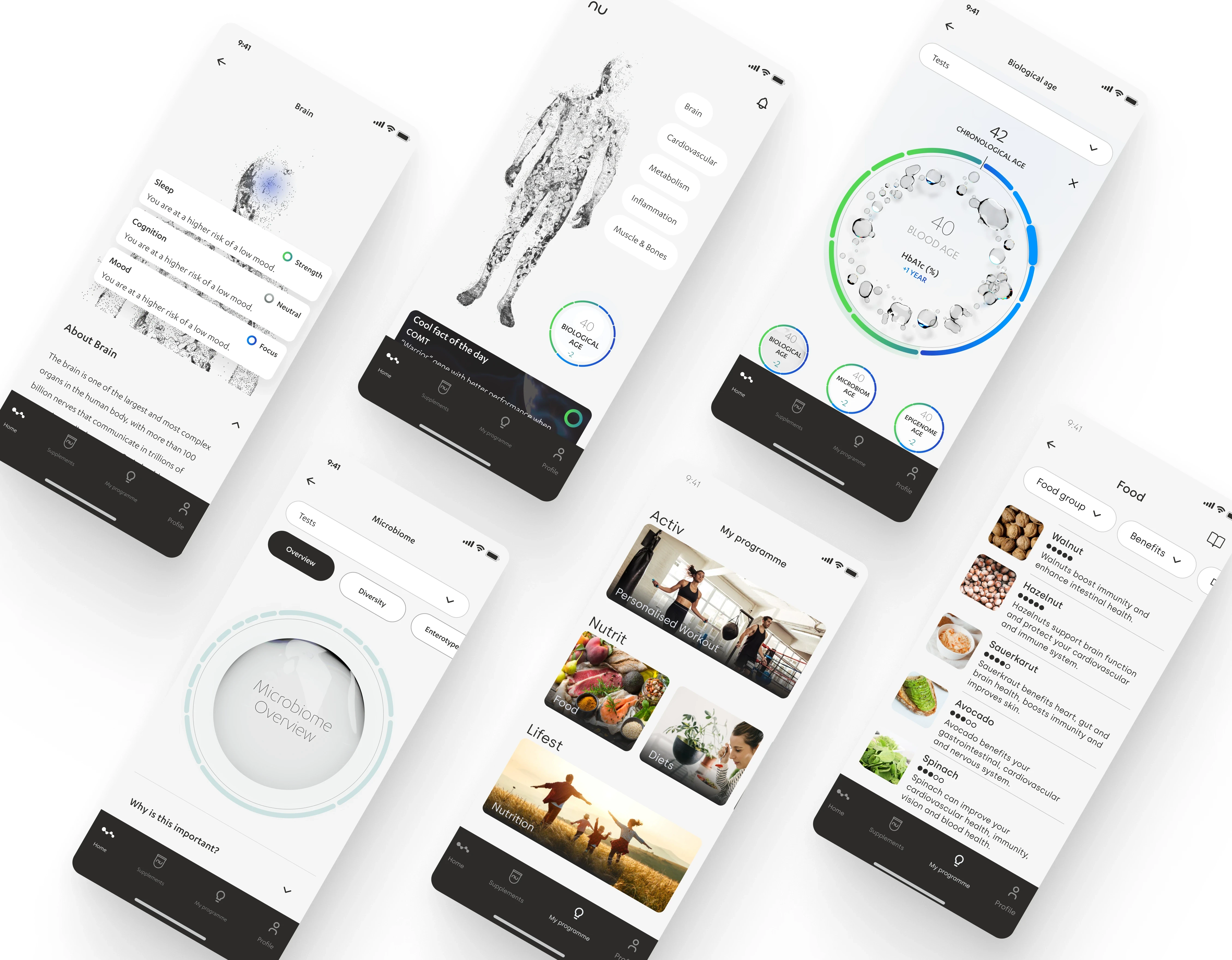
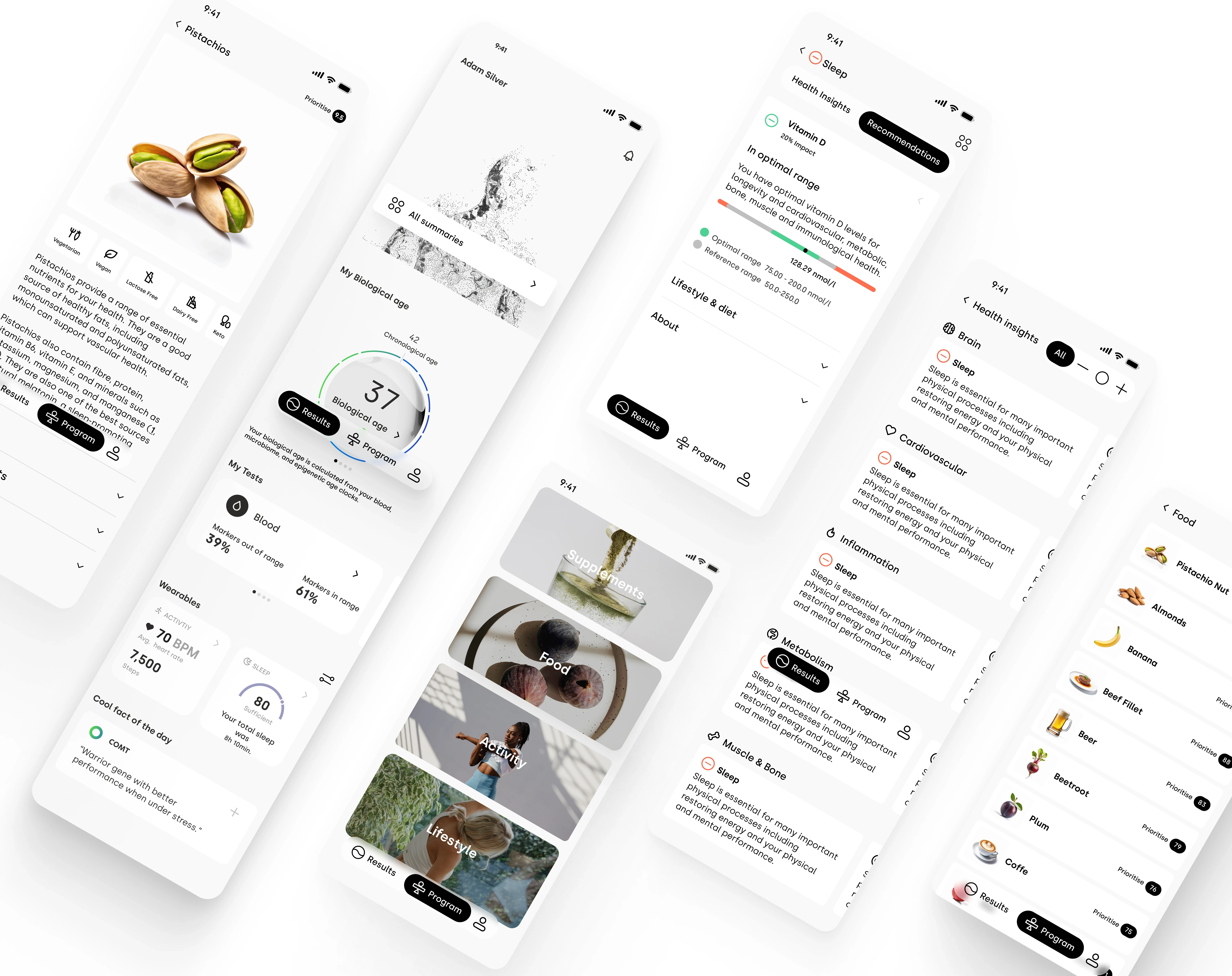
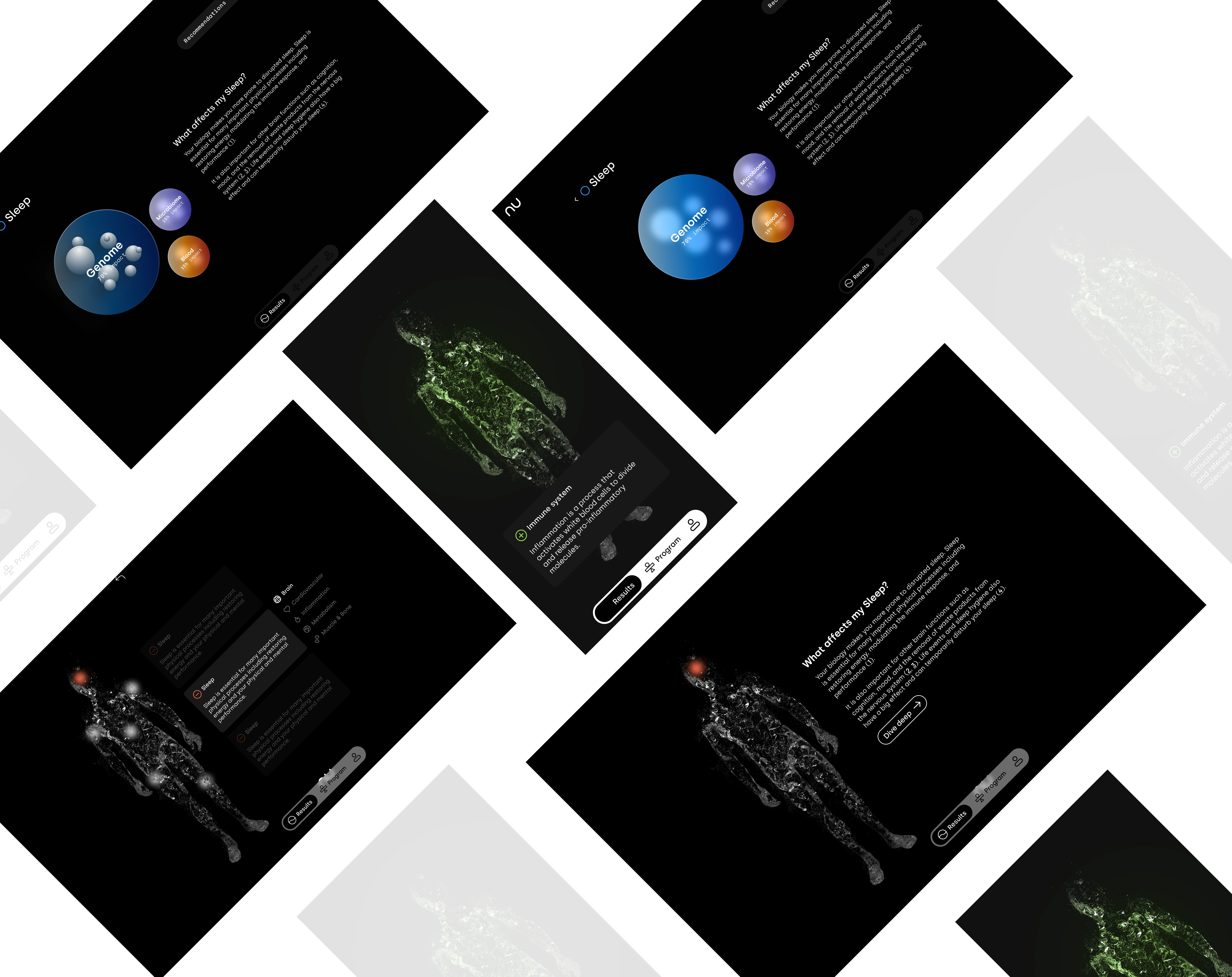
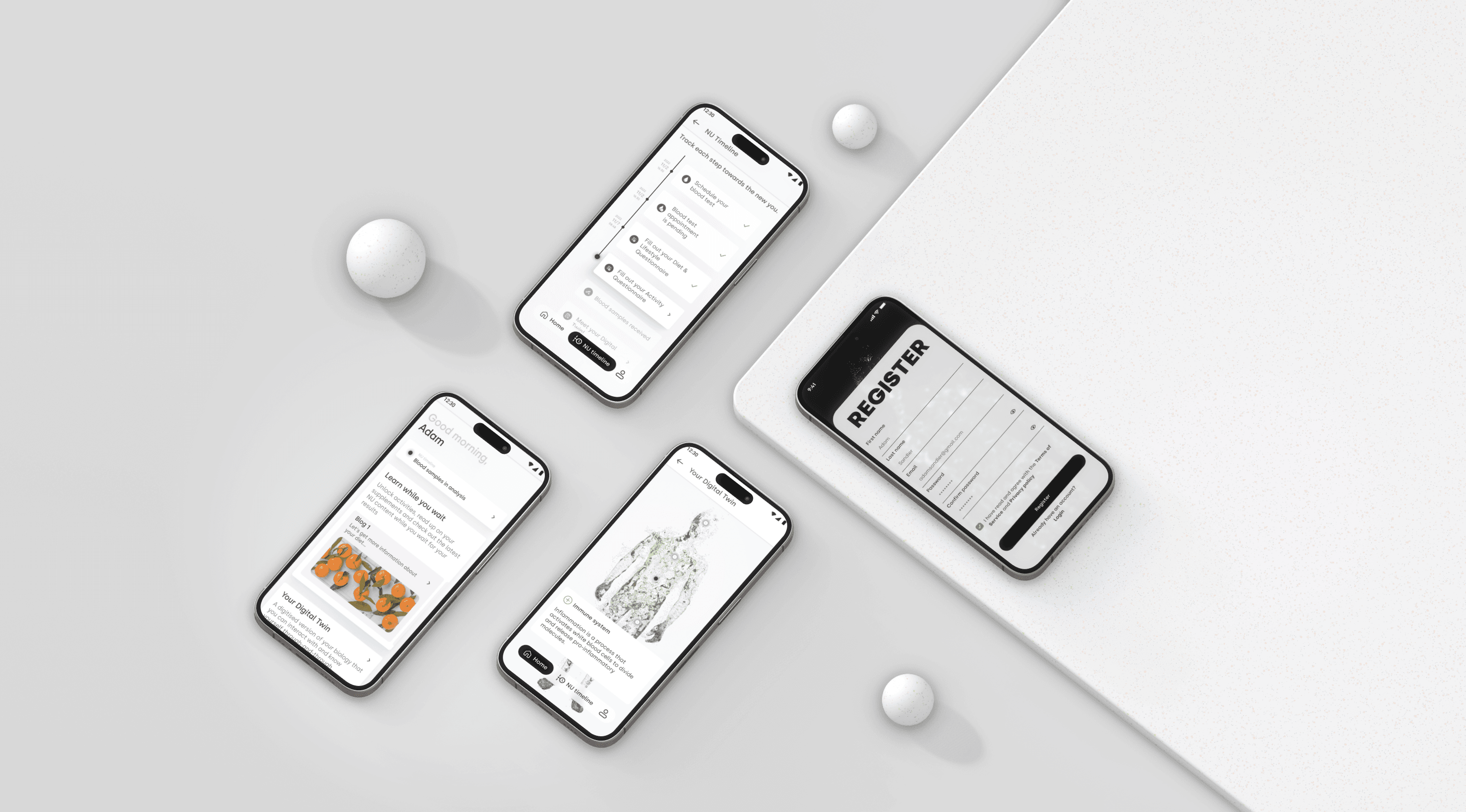
NU, a health tech company, aimed to simplify health data and boost user engagement through a redesigned companion app. I focused on making complex information accessible, improving navigation, and adding features for regular use. Through research and collaboration, we delivered an intuitive, user-friendly platform that aligned with NU’s mission.
*Due to a signed NDA, I'm unable to showcase specific details of my work in my portfolio. However, I'd be delighted to discuss it further during a call.
1. Simplifying Data
Making complex health data easy to understand for users without healthcare backgrounds, as many struggled with overly detailed results.
2. Balancing Simplicity and Value
Designing a user-friendly interface that remains engaging, ensuring users have a reason to return to the app regularly.
3. Encouraging Engagement
Adding features that provide ongoing value, prompting users to revisit and use the app consistently for updates and retesting.
Team Collaboration:
Engaged in in-depth discussions with the stakeholders and the team to understand their vision, user needs, and challenges, focusing on simplifying health data for non-experts and boosting engagement.
Competition Research:
Analyzed competitor health apps and trends to identify best practices in data presentation, user engagement, and feature integration.
UI/UX Design
Developed a clean and intuitive interface, making it easy for users to navigate and understand their health data, even without a science background.Feature Integration
Added features like personalized reminders and progress tracking to encourage regular app use and keep users engaged with their health journey.Prototyping
Built wireframes and prototypes to visualize the user journey, facilitating stakeholder presentations and alignment with the app’s vision.
User Testing:
Conducted usability testing before and after launch, using feedback to refine the design and enhance user experience.Continuous Improvement:
Implemented updates based on user insights, optimizing the app’s design and adding features to ensure simplicity and value.
The impact on users was largely positive, with many reporting a better understanding of their health data and valuing the app's simplified visuals. However, some users still found certain aspects of the app complex, as revealed in user interviews. This feedback led to a proactive response, with several updates implemented to improve navigation and user experience, demonstrating a commitment to continuous improvement.
