Waiting room

Waiting room

Waiting room

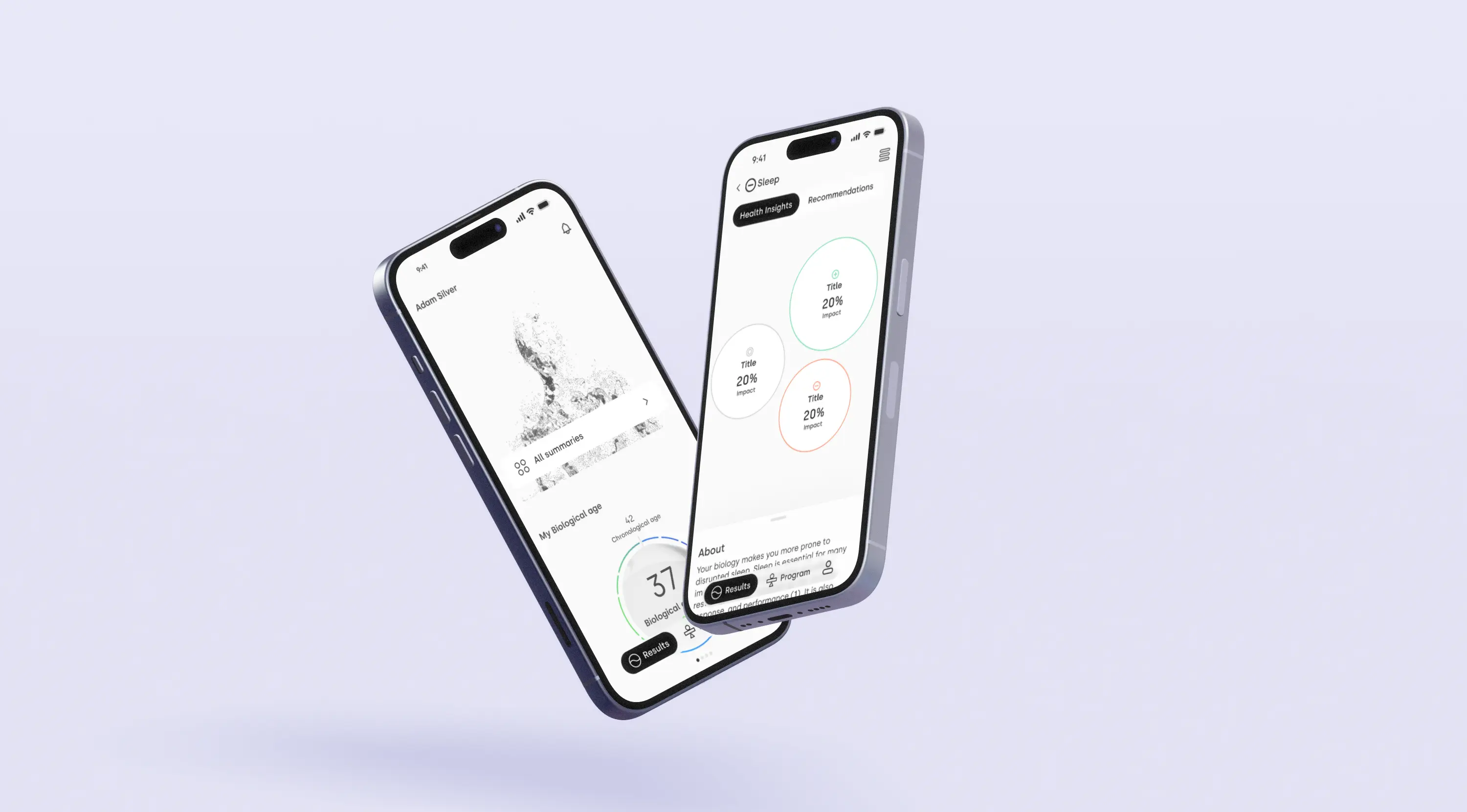
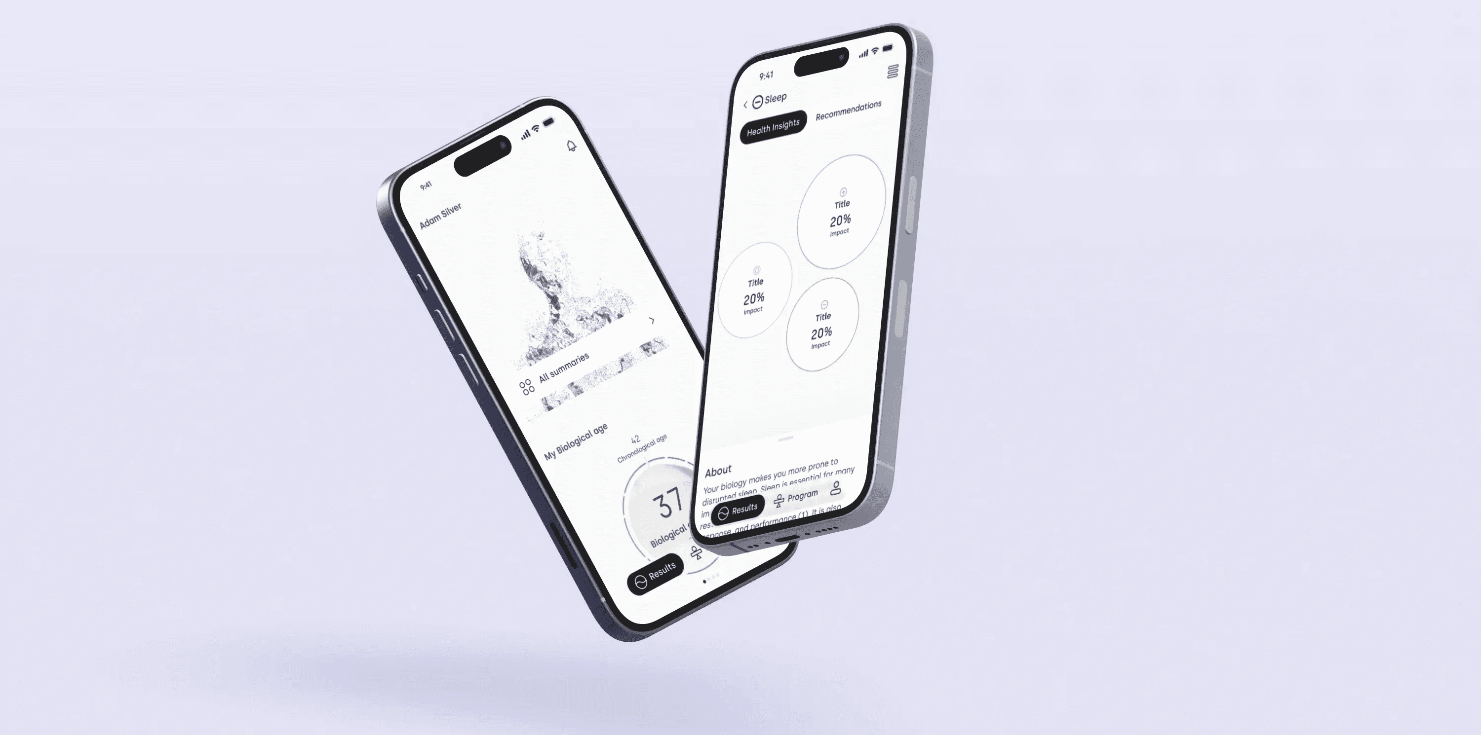
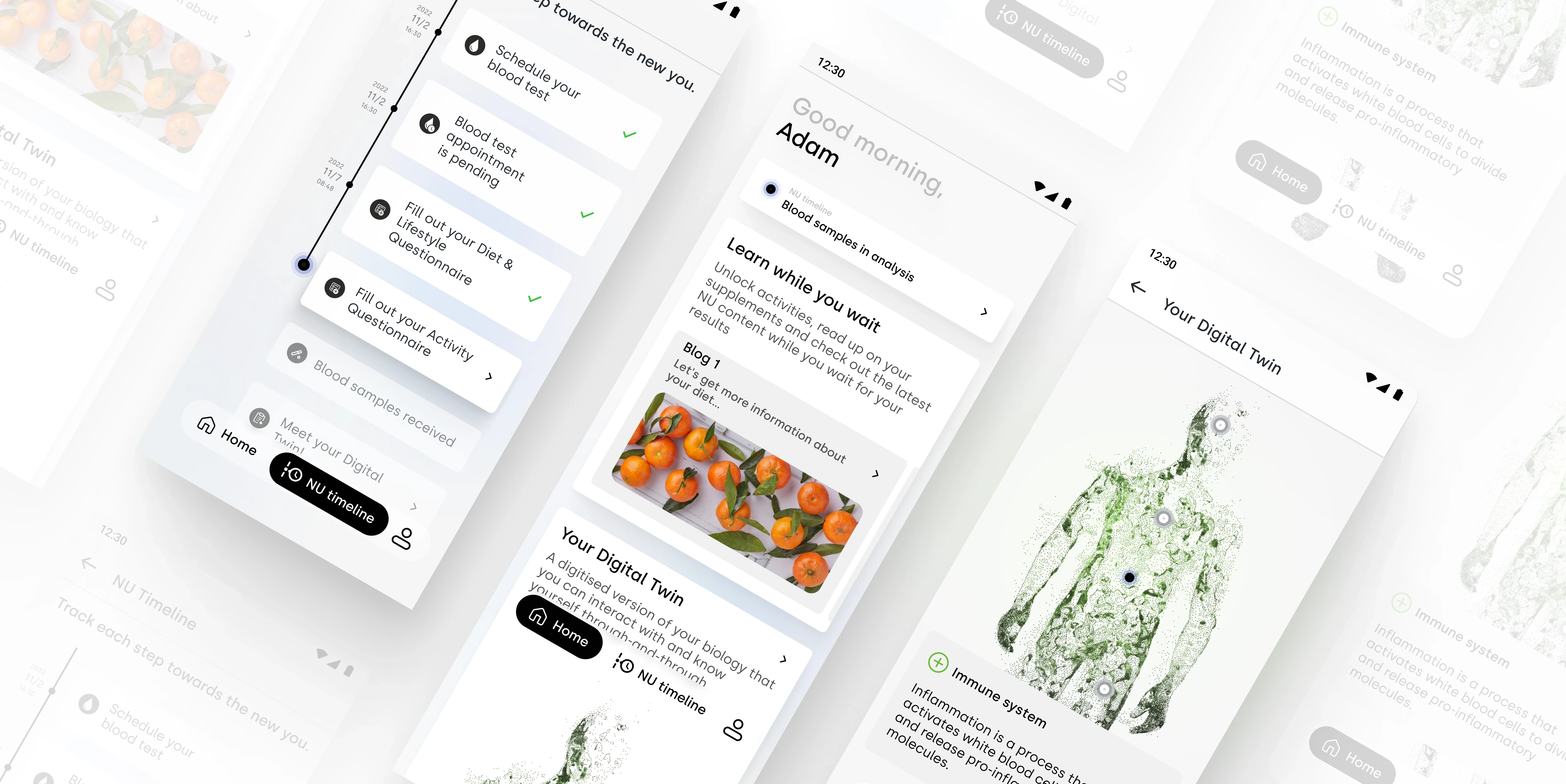
The app's waiting room was created to give users a sense of trust and transparency throughout the process with their test kits and samples. They needed a seamless experience, guiding users through every step—from purchasing and correctly completing their samples to receiving their results. This was accomplished through thorough research, thoughtful design, and close collaboration with cross-functional teams.

The app's waiting room was created to give users a sense of trust and transparency throughout the process with their test kits and samples. They needed a seamless experience, guiding users through every step—from purchasing and correctly completing their samples to receiving their results. This was accomplished through thorough research, thoughtful design, and close collaboration with cross-functional teams.

The app's waiting room was created to give users a sense of trust and transparency throughout the process with their test kits and samples. They needed a seamless experience, guiding users through every step—from purchasing and correctly completing their samples to receiving their results. This was accomplished through thorough research, thoughtful design, and close collaboration with cross-functional teams.

Date: 2022 - 2024

Client: The NU

URL: www.thenu.com

Date: 2022 - 2024

Client: The NU

URL: www.thenu.com

*Due to a signed NDA, I'm unable to showcase specific details of my work in my portfolio. However, I'd be delighted to discuss it further during a call.

*Due to a signed NDA, I'm unable to showcase specific details of my work in my portfolio. However, I'd be delighted to discuss it further during a call.

*Due to a signed NDA, I'm unable to showcase specific details of my work in my portfolio. However, I'd be delighted to discuss it further during a call.

Challenges

Challenges

1. Clarity of Process

Users face difficulties understanding the steps after purchase, leading to a less smooth experience and potential mistrust in the overall process.

2. User Engagement

Maintaining user engagement during prolonged waiting periods is a challenge, as users may overlook important tasks like completing health and lifestyle questionnaires, which can impact the accuracy of personalized recommendations in the NU app.

3. User Experience

Creating a smooth journey from purchase to results is challenging, requiring clear guidance to prevent confusion and ensure user satisfaction and trust.

My approach

My approach

My approach

01

01

01

Discovery Phase

Discovery Phase

Discovery Phase

  • Team Collaboration:

    Conducted competitive research, workshops, and meetings to align on business metrics and goals, ensuring a shared understanding of the project vision

  • Competition Research:

    Analyzed competitor apps to identify industry standards and opportunities for differentiation.

02

02

02

Design and Development

Design and Development

Design and Development

  • UI/UX Exploration:
    Explored various screen layouts for the app, experimenting with different structures to best convey the NU app's value proposition. Prototyped wireframes to present a clear vision during executive presentations.

  • UI/UX Exploration:
    Explored various screen layouts for the app, experimenting with different structures to best convey the NU app's value proposition. Prototyped wireframes to present a clear vision during executive presentations.

  • UI/UX Exploration:
    Explored various screen layouts for the app, experimenting with different structures to best convey the NU app's value proposition. Prototyped wireframes to present a clear vision during executive presentations.

03

03

03

Testing and Iteration

Testing and Iteration

Testing and Iteration

  • User Testing:
    Conducted testing before and after launch, regularly refining the user experience based on feedback. Continuously improved the design by adding new features and enhancements.

  • User Testing:
    Conducted testing before and after launch, regularly refining the user experience based on feedback. Continuously improved the design by adding new features and enhancements.

04

04

04

results

results

results

The waiting room design clarified steps for users, building trust and transparency. They valued the clear guidance and reminders about important tasks. However, it didn't completely solve user disengagement during longer waits, with some users not engaging as expected. Since then, we have put focus on how shorten the time from purchase to results reveal and have focused on the next phases of the app.
Other projects

Other projects